JavaScript中transform如何實現(xiàn)數(shù)字翻頁效果-創(chuàng)新互聯(lián)
這篇文章主要為大家展示了“JavaScript中transform如何實現(xiàn)數(shù)字翻頁效果”,內(nèi)容簡而易懂,條理清晰,希望能夠幫助大家解決疑惑,下面讓小編帶領(lǐng)大家一起研究并學習一下“JavaScript中transform如何實現(xiàn)數(shù)字翻頁效果”這篇文章吧。

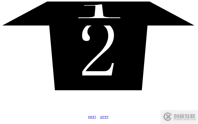
效果圖:

圖(1)初始圖
圖(2)翻頁過程

圖(3)翻頁結(jié)果
代碼如下:
<!doctype html>
<html lang="en">
<head>
<meta charset="UTF-8">
<title>transition</title>
<style>
#container{ width:500px; height:500px; margin:20px auto; background:#ff0000;
-webkit-transiton:background 2s linear,width 2s,height 2s;
-moz-transition:background 2s,width 2s,height 2s;
-o-transition:background 2s,width 2s,height 2s;
-ms-transition:background 2s,width 2s,height 2s;
transition:background 2s,width 2s,height 2s;
}
#container:hover{ background: #00ff00;width:200px;height: 200px;}
#my3dspace{
-webkit-perspective:800;
-webkit-perspective-origin:50% 50%;
overflow: hidden;
}
#pagegroup{
width: 400px;
height: 400px;
margin: 0 auto;
-webkit-transform-style:preserve-3d;
position: relative;
}
.page{
width: 360px;
height: 360px;
padding: 20px;
background-color: black;
color: white;
font-size: 360px;
font-weight: blod;
line-height: 360px;
text-align: center;
position: absolute;
}
#page1{
-webkit-transform-origin:top;
transform-origin:top;
-webkit-transition:-webkit-transform 1s linear;
transition:transform 1s linear;
}
#page2,#page3,#page4,#page5,#page6{
-webkit-transform-origin:top;
transform-origin:top;
-webkit-transition:-webkit-transform 1s linear;
transition:transform 1s linear;
-webkit-transform:rotateX(-90deg);
transform:rotateX(-90deg);
}
#op{
text-align: center;
margin: 40px auto;
}
</style>
</head>
<body>
<div id="my3dspace">
<div id="pagegroup">
<div class="page" id="page1">1</div>
<div class="page" id="page2">2</div>
<div class="page" id="page3">3</div>
<div class="page" id="page4">4</div>
<div class="page" id="page5">5</div>
<div class="page" id="page6">6</div>
</div>
</div>
<div id="op">
<a href="javascript:next()" rel="external nofollow" >next</a>
<a href="javascript:prev()" rel="external nofollow" >prev</a>
</div>
<script type="text/javascript">
var curIndex = 1;
function next(){
if(curIndex==6)
return;
var curPage = document.getElementById("page"+curIndex);
curPage.style.webkitTransform = "rotateX(90deg)";
curPage.style.transform = "rotateX(90deg)";
curIndex ++;
var nextPage = document.getElementById("page"+curIndex);
nextPage.style.webkitTransform="rotateX(0deg)";
nextPage.style.transform="rotateX(0deg)";
}
function prev(){
if(curIndex==1)
return;
var curPage =document.getElementById("page"+curIndex);
curPage.style.webkitTransform="rotateX(-90deg)";
curPage.style.transform="rotateX(-90deg)";
curIndex --;
var prevPage = document.getElementById("page"+curIndex);
prevPage.style.webkitTransform="rotateX(0deg)";
prevPage.style.transform="rotateX(0deg)";
}
</script>
</body>
</html>以上是“JavaScript中transform如何實現(xiàn)數(shù)字翻頁效果”這篇文章的所有內(nèi)容,感謝各位的閱讀!相信大家都有了一定的了解,希望分享的內(nèi)容對大家有所幫助,如果還想學習更多知識,歡迎關(guān)注創(chuàng)新互聯(lián)網(wǎng)站建設公司行業(yè)資訊頻道!
另外有需要云服務器可以了解下創(chuàng)新互聯(lián)建站www.chinadenli.net,海內(nèi)外云服務器15元起步,三天無理由+7*72小時售后在線,公司持有idc許可證,提供“云服務器、裸金屬服務器、高防服務器、香港服務器、美國服務器、虛擬主機、免備案服務器”等云主機租用服務以及企業(yè)上云的綜合解決方案,具有“安全穩(wěn)定、簡單易用、服務可用性高、性價比高”等特點與優(yōu)勢,專為企業(yè)上云打造定制,能夠滿足用戶豐富、多元化的應用場景需求。
標題名稱:JavaScript中transform如何實現(xiàn)數(shù)字翻頁效果-創(chuàng)新互聯(lián)
文章路徑:http://www.chinadenli.net/article40/dsooeo.html
成都網(wǎng)站建設公司_創(chuàng)新互聯(lián),為您提供Google、網(wǎng)站建設、電子商務、網(wǎng)站排名、標簽優(yōu)化、做網(wǎng)站
聲明:本網(wǎng)站發(fā)布的內(nèi)容(圖片、視頻和文字)以用戶投稿、用戶轉(zhuǎn)載內(nèi)容為主,如果涉及侵權(quán)請盡快告知,我們將會在第一時間刪除。文章觀點不代表本網(wǎng)站立場,如需處理請聯(lián)系客服。電話:028-86922220;郵箱:631063699@qq.com。內(nèi)容未經(jīng)允許不得轉(zhuǎn)載,或轉(zhuǎn)載時需注明來源: 創(chuàng)新互聯(lián)

- 網(wǎng)站域名備案與網(wǎng)站排名有關(guān)系嗎 2013-12-20
- 看剛做半年的網(wǎng)站排名是如何排在百度首頁的 2020-01-29
- 網(wǎng)站排名穩(wěn)定需要做好哪些事呢 2021-08-11
- SEO診斷:網(wǎng)站排名下降,是發(fā)外鏈的原因嗎? 2020-09-04
- 企業(yè)網(wǎng)站排名穩(wěn)定的幾大原因是什么? 2013-08-08
- 域名對網(wǎng)站排名的重要性 2021-04-24
- 是什么導致了網(wǎng)站排名下降 2022-05-09
- 如何保持網(wǎng)站排名穩(wěn)定? 2013-09-05
- 快速提升企業(yè)網(wǎng)站排名的方法有哪些? 2013-10-06
- 成都網(wǎng)絡公司什么因素影響網(wǎng)站排名 2022-06-20
- 濟南網(wǎng)站排名百度小措施署理商進口官網(wǎng),開拓建造,OEM貼牌,招 2023-01-03
- 如何解決網(wǎng)站排名不穩(wěn)定的問題 2020-12-09